My younger brother, also a programmer 🙂 , shared with me this little nifty keyboard short-cut and introduced to Mozilla Firefox’s awesome Responsive Design View. I am happy to share it with my readers and for my future reference.
In the past I had to use plug-ins, or resize window manually. But Firefox has made it so simple and so great.
1. Keyboard shortcut is : Ctrl + Shift + M (when you are on FireFox)
2. And Your Firefox will tranform itself to awesome responsive design viewer, you can check different views and enjoy.
Also it really helps to test bigger screens sizes even on smaller screens. It really helps the developer to create responsive web design from their own laptop and quickly check the different screen views without needing any manual window resizing or third party sluggish plugins.
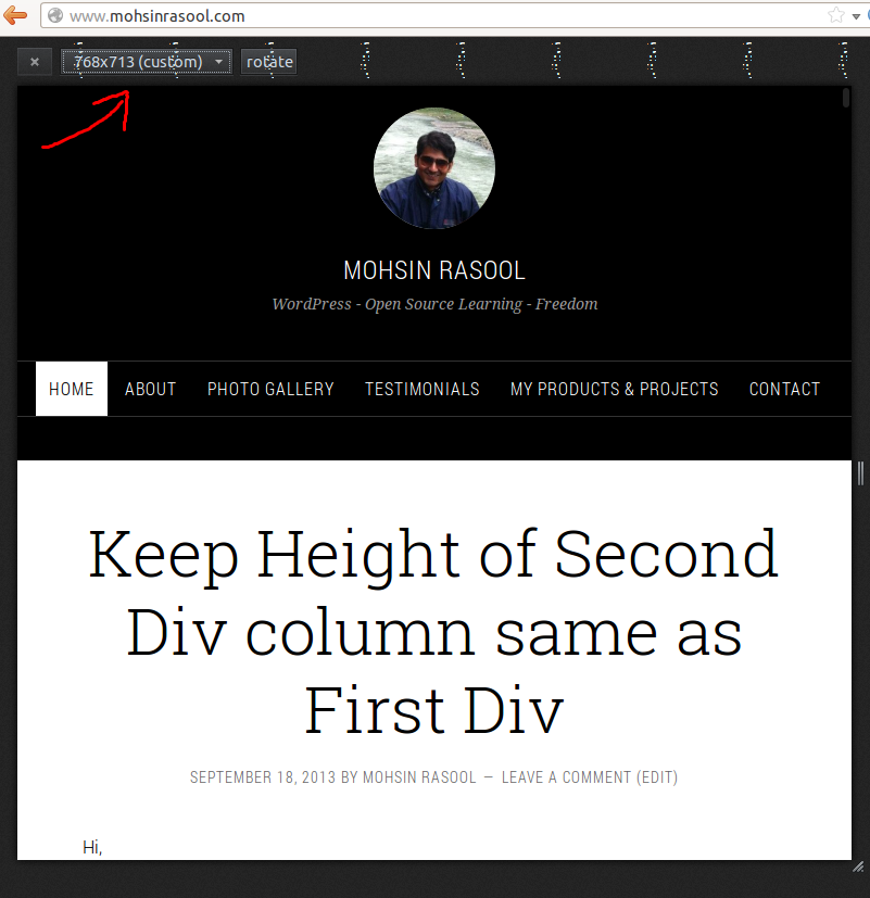
See my site in different views in below screenshots:
")